Otto: Evaluating The Navigation
During the selection process for a UX position, I was asked to review the E-Commerce website Otto with regard to its Navigation features.


It was June 2021.
During the selection process for a UX position, I was asked to review the E-Commerce website Otto with regard to its Navigation features.
Here are the slides with a presentation in which I shared some insights, recommendations and findings:

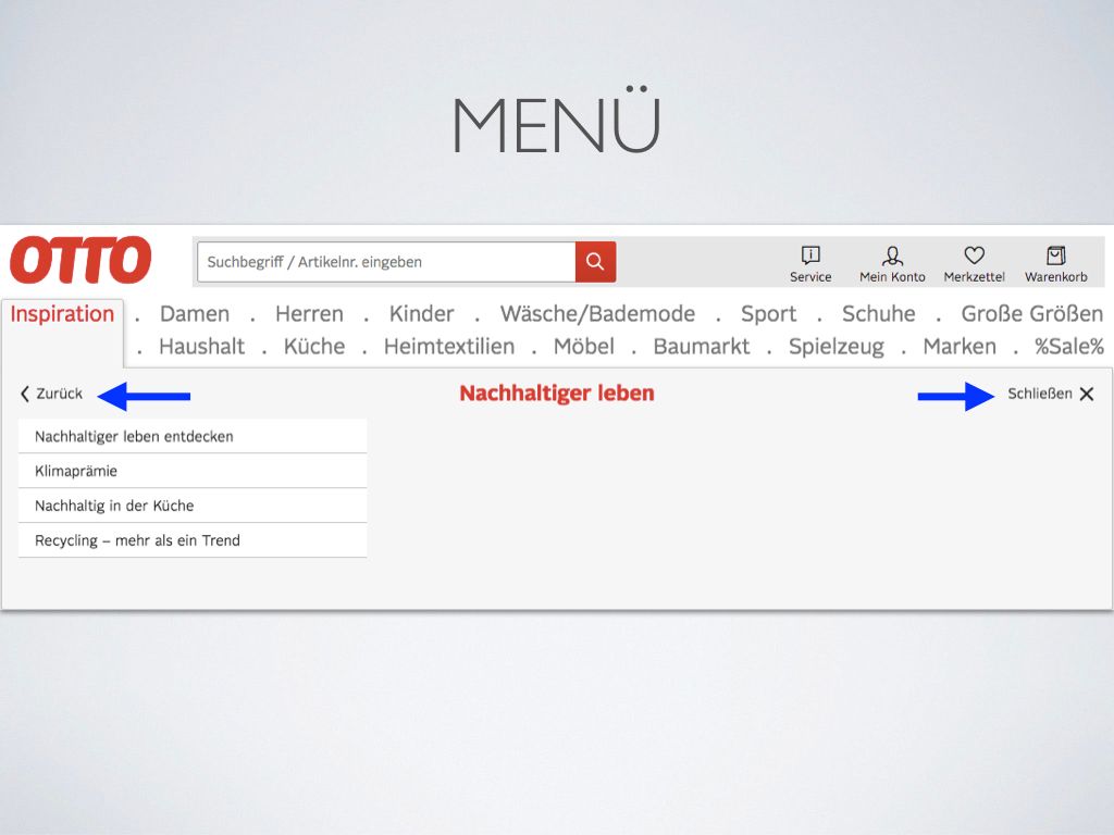
I liked a lot that I had the option of actively closing the menu, and going back to the past navigation layer.
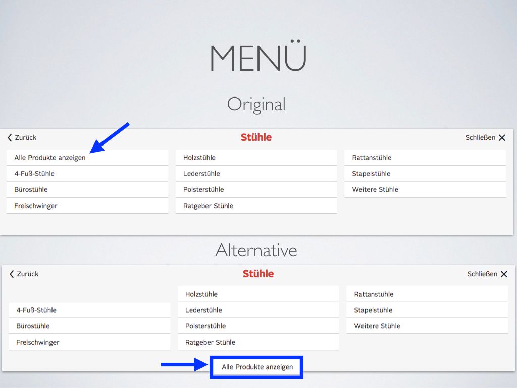
What if we tried to take the option "Alle Produkte anzeigen" and display it separated from the subcategories?
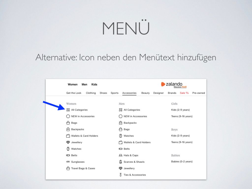
What if we experimented with having icons next to the category descriptions?
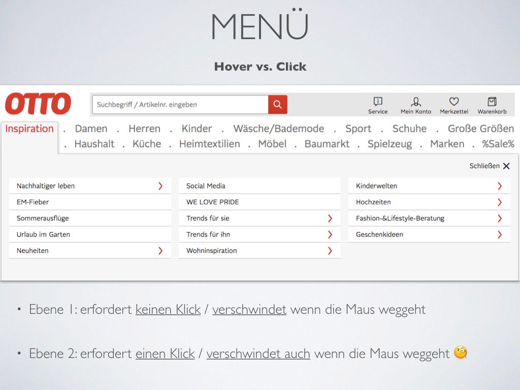
Ok, here's an interesting finding.
When you hover the mouse pointer over the menu, the menu pops up and shows its subcategories.
Once you interact with one of the subcategories by clicking on the red arrow, you reach the next level. When this happened, I had the expectation that it would be required to click outside the menu area in order to close the menu.
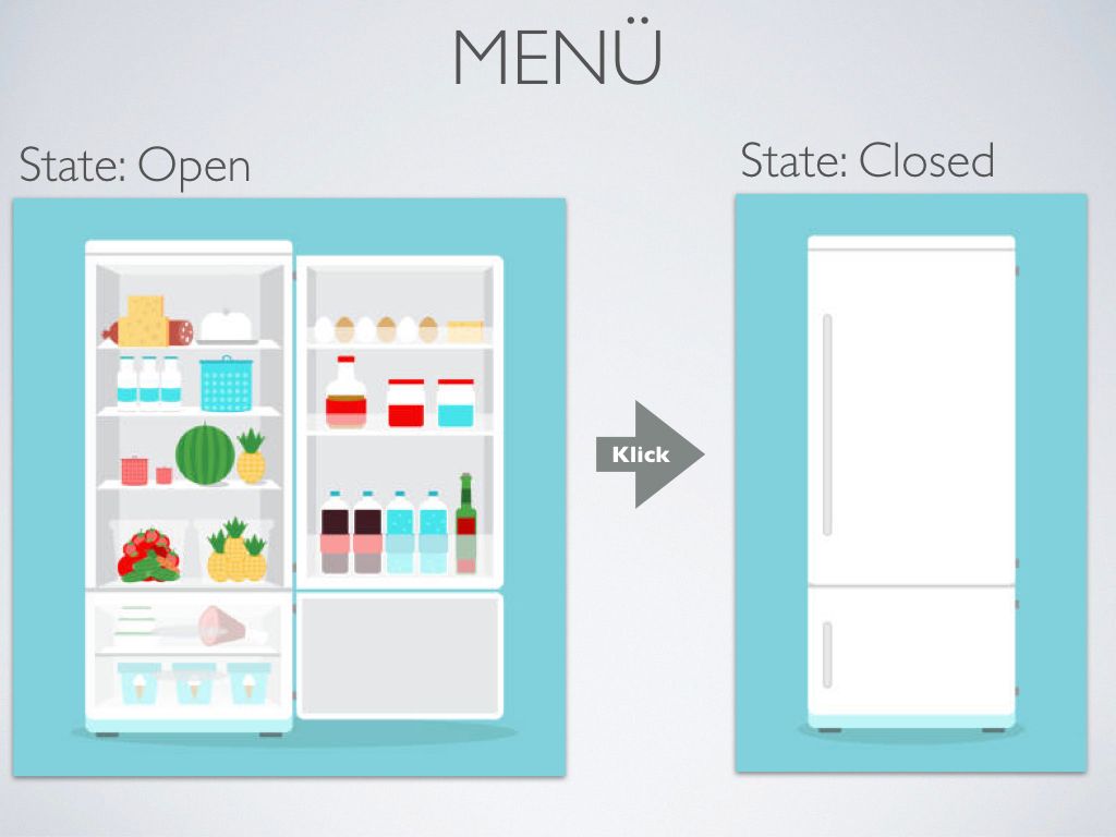
But that's not the case. Just by moving the pointer outside the menu area already closes it. I did not understand why I was frustrated with this interaction. But after some time thinking about it, I came up with the analogy of using a refrigerator.
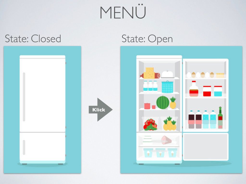
When I clicked on the red arrow, I had the feeling that I had opened the door of the refrigerator to see what's inside.
This means that I had the expectation of being required to click once again in order to close it.

This kind of mega menu, in which not only text but also huge images are shown, may also be something worth experimenting with.
Now let's take a look at the Search function.
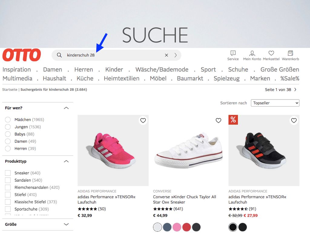
The search function successfully returned the size that I wanted.
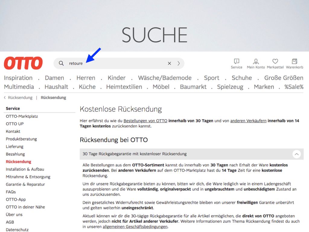
The static page about Returnings was also found when I searched for it.
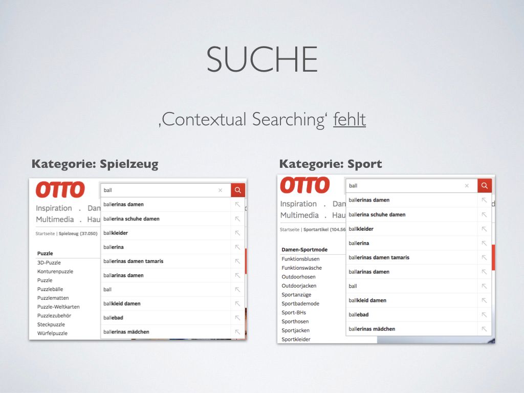
But one feature that is missing is Contextual Searching, which is the ability of the website to adapt the results depending on the category that the user visits at a certain moment.
To test this function, I have searched the term 'ball' in two different contexts:
- From the Toys page, with the expectation that balls for children to play with would be suggested.
- From the Sports page, with the expectation that balls for sports activities would show up in the results.
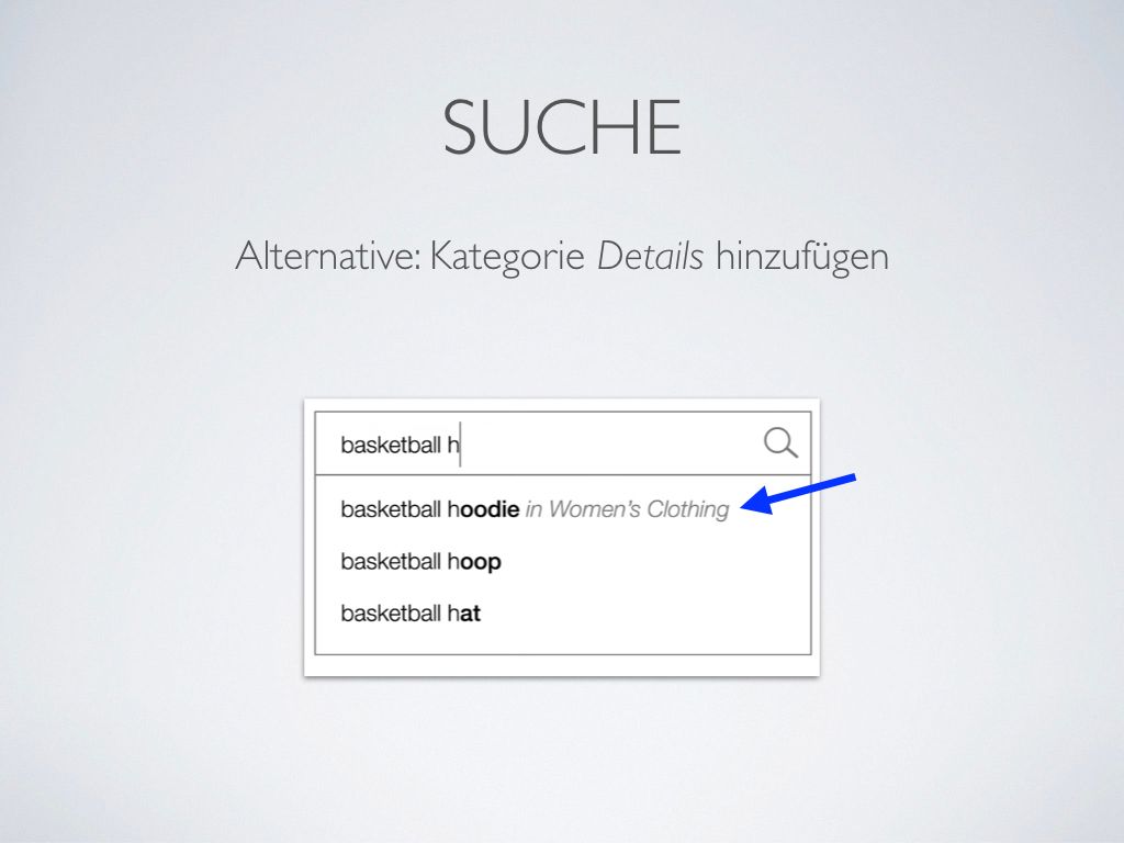
One alternative would be to show a description of the category of the search result next to the result, as shown above.
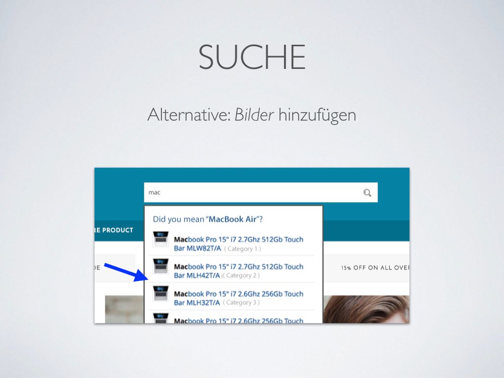
Another idea would be to display images to illustrate each result.
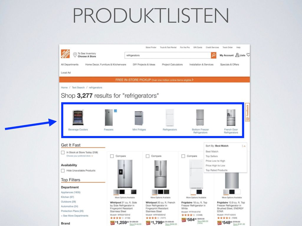
When it comes to Product Lists, one idea would be to display the most relevant categories on the top, separated from the results list.
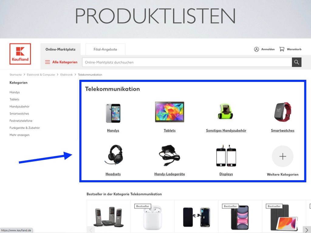
Here is another example of the most relevant categories being displayed on top. But this time, this result was presented when navigating through the categories, and not through search.
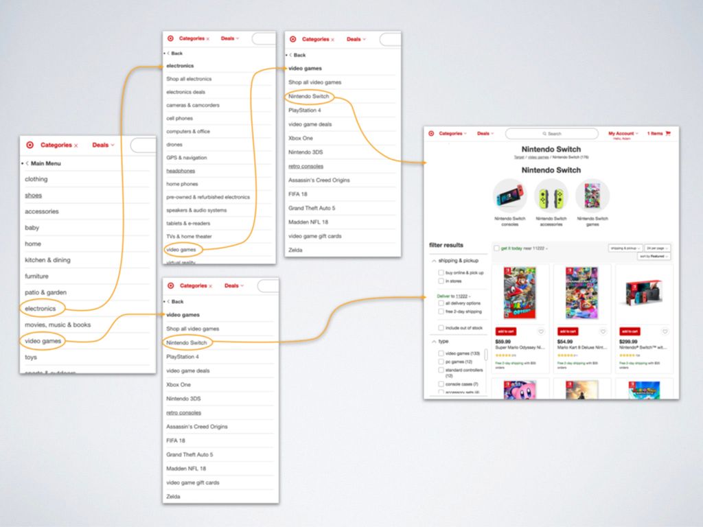
Sometimes different paths through the categories can lead to the same product.
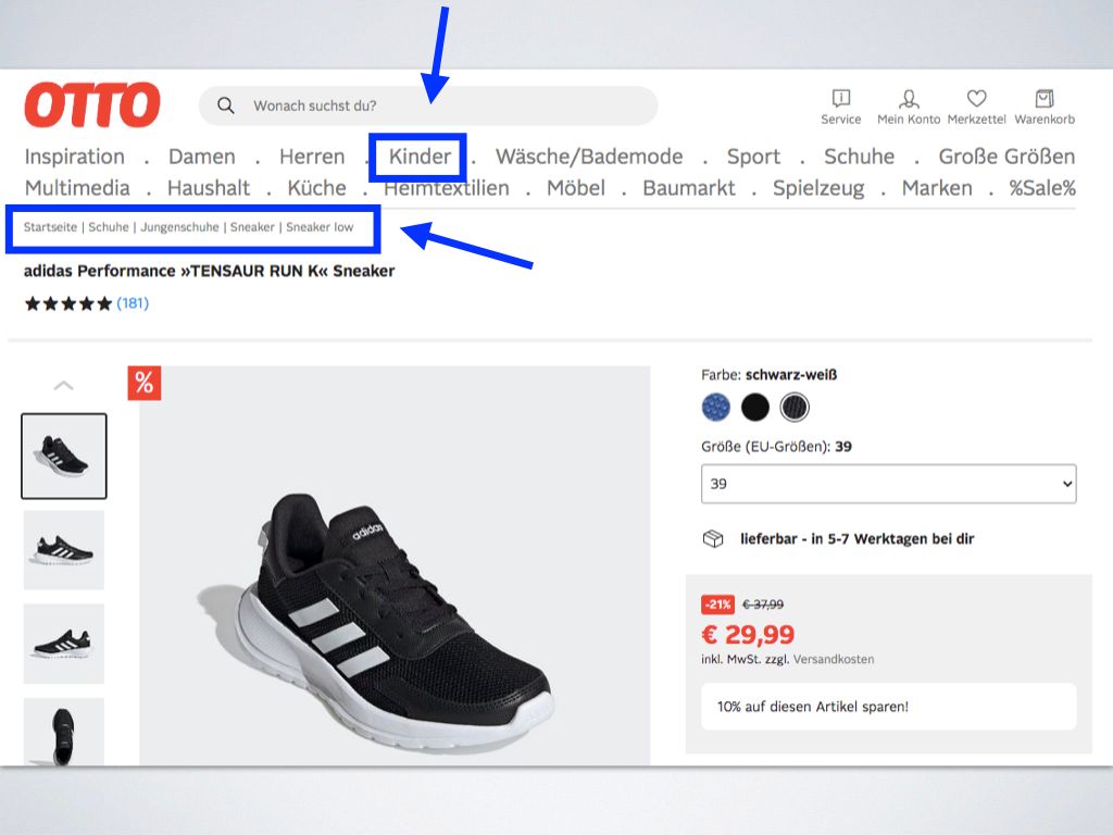
For example, a user can reach the sneakers above navigating from Child, or Shoes categories.
This means that I had to reflect on the challenges that would come with the embracement of polyhierarchy and move away from the linearity of the typical Breadcrumbs.
Lastly, to keep learning about the subject I would check the research found on the following websites:
- https://www.nngroup.com/articles/
- https://baymard.com/blog