Forefront Consulting: Reviewing The Website
I work for this company as a contractor. And my boss asked me to review the website at an early stage of the development.


Website
Date of the review
- 12/07/2020
Context
- Recently I have been working as a contractor for the company Forefront Consulting, mostly in our internal own content. This review is a good example of the work I have been doing lately with the team. I received a very positive feedback from these suggestions, as they guided what the design professional had to do next.
- This activity doesn't highlight the usage of any proper UX method. But I believe it shows how I approach design problems, and how I justify UX decisions based on research (from Nielsen Norman Group), rather than solely on subjective taste.
Desktop screen specifications
Device
- Apple 13’’ MacBook Air
Resolution
- 1440 x 900
Browser
- Chrome
OS
- MacOs
Mobile screen specifications
Device
- Pixel 3a
Screen size
- 5.6-inch
Browser
- Chrome
OS
- Android
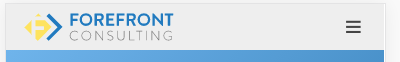
'Top menu' on Desktop

What I like
- The logo fits the website as a whole in terms of color and style.
- The number of items on the menu (5) is very good.
What maybe could be improved
- Shouldn't we use Who We Are, instead of Who are we. The latter sounds like a question.
'Top menu' on Mobile
State: Before clicking on Hamburger menu
State: After clicking on hamburger menu
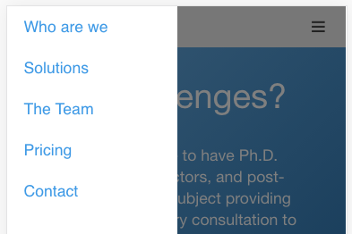
Recommendation
I think we should consider removing the hamburger menu:
- Ideally we would simply display the 5 menu items on the top all the time
- If not possible, using a dropdown menu (titled 'Menu') instead of a hamburger may work better
Explanation
According to Nielsen Norman Group, hamburger menus are in general bad in terms of usability:
- Reference article: Hamburger Menus and Hidden Navigation Hurt UX Metrics
- Reference video below
'Hero animation' section
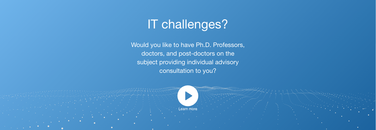

What I like
- The animation is fluid and looks modern. It also matches the whole website in terms of content and style.
- The amount of text seems adequate.
- It took me a while to see that the animation changed with the mouse cursor.
What maybe could be improved
- Both the title and the subtitle are questions. I believe a statement about the added value would be helpful.
- I believe it's crucial to consider the tone of voice that we are going to use. This can be used to establish the boundaries or a reference framework of how we communicate.
Reference article: The Four Dimensions of Tone of Voice
Reference video below
'Who are we?' section
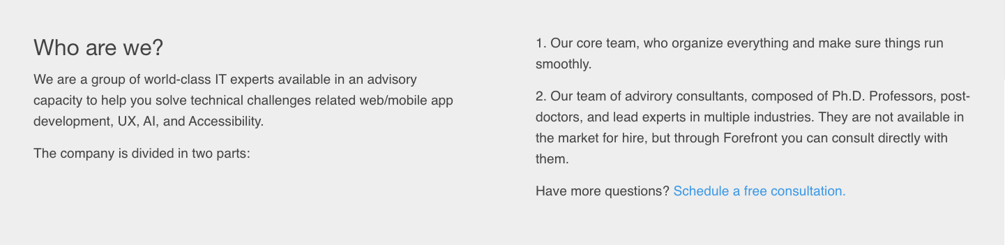
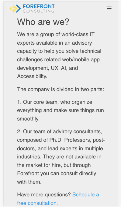
What I like
- The text distribution in two columns (desktop)
- The call to action being displayed straight away with the link to the free consultation. I didn't think about having it 'so early', but it sets the tone to the experience and I find it a very good idea.
What maybe could be improved
- I don't think that the way the company is structured and operates is so important for the client. I think we should use this area to further expand the benefits that the clients have by hiring us.
'Ideas' section
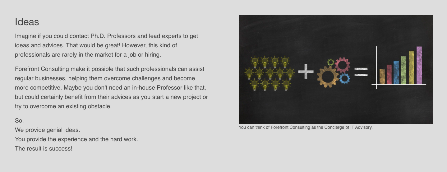
What I like
- How the text hits a major benefit.
What maybe could be improved
- I will research, to try to make sure that's the case. But I think that the image used in this section is too generic and does not convey the concierge type of work that our company offers.
- Instead of having Ideas as title, I can imagine that some other term like Approach/Method could work better.
- We have already enunciated our values. Maybe they could come in this section.
'How does this work' section
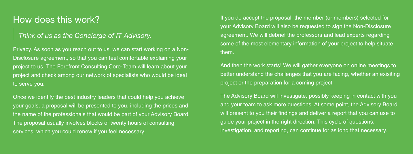
What I like
- The color makes this area pop up.
What maybe could be improved
- I think this information could either be displayed as a step-by-step process, or be moved to the FAQ area.
The content below has some valuable tips on how we present ourselves trustworthy.
Here's a short summary of the four credibility factors:
- Design Quality: navigation must be well organized and the site should use an appropriate color scheme and imagery.
- Upfront Disclosure: upfront with all information that relates to the customer experience.
- Comprehensive, Correct, and Current: the content on the website must represent the full range of services or products offered by the organization.
- Connected to the Rest of the Web: people have learned to trust these external sources more than company-sponsored content.
Reference article: Trustworthiness in Web Design: 4 Credibility Factors
Reference video
'Team' section
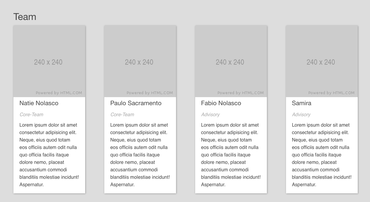
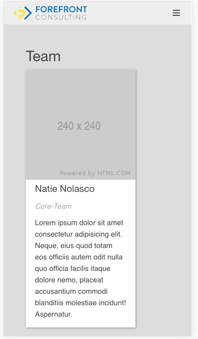
What I like
- I love cards in general. I think they worked great here.
What maybe could be improved
- In the desktop version, could we have a showcase style with the option of scrolling the cards left and right?
- If we decide to keep it how it is, I would like to see the card larger (width) on the mobile version. There's a difference between the left and right margin.
'Case study' section
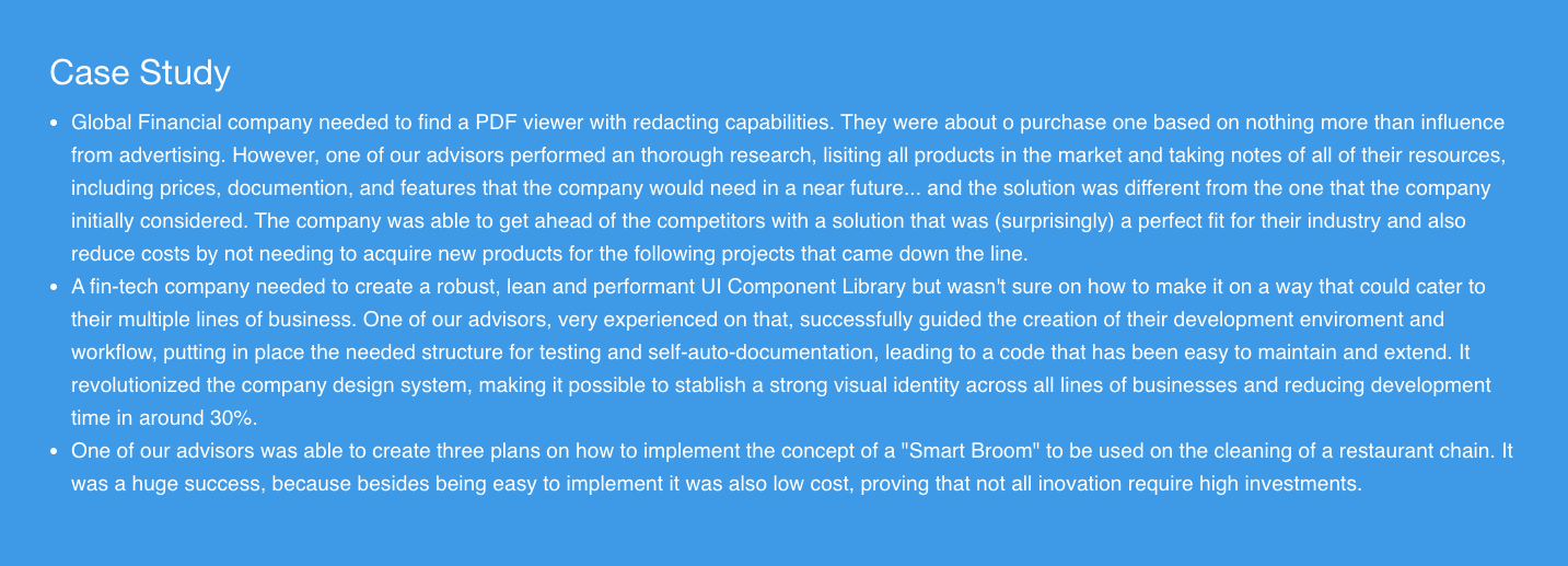
What I like
- All three examples are excellent, because they tell about real situations in which previous clients achieved success by hiring us.
What maybe could be improved
- I believe we could insert images to illustrate each one of the cases. This would improve the legibility, because it would separate each text block. Maybe a 3 columns structure, each one with its image header would be appropriate.
'Pricing' section
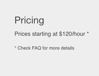
What I like
- That it gives a reference point of how much the client would spend.
What maybe could be improved
- I'm not sure that is necessary to recommend checking the FAQ. If the person scrolled all the way down, I can imagine that he or she will keep on scrolling. But that's just a supposition. I'm not sure and don't have any research to back this claim.
- I believe we should offer more information about everything that the client gets by hiring us, together with the price. It's important to state even the most basic items included, because a comprehensive list of several items can make the client perceive as more complete.
- My most important recommendation is that we show sample prices, as recommended in this reference article.
Here's an interesting excerpt:
Many B2B products and services are complex. The pricing structure varies for each client based on countless situations. Still, this is no excuse not to show pricing information. Prospects need immediate access to basic information during initial research. Estimates can often appease prospects during the research phase. When showing exact costs is unrealistic, help users by showing prices for typical scenarios, price range, or manufacturer’s suggested retail price (MSRP). Be sure to consult your legal department to determine appropriate and accurate ways to display your pricing information.
'FAQ' section
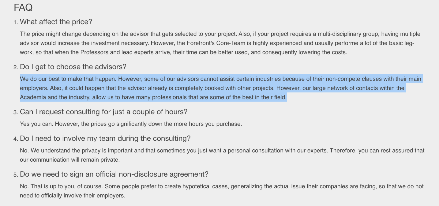
What I like
- How so many areas have been mentioned. As a client, this would be a reason
What maybe could be improved
- Accordions could be helpful in this section. There are some tips on how and when to use accordions here.
Accordions are more suitable when people need only a few key pieces of content on a single page. By hiding most of the content, users can spend their time more efficiently focused on the few topics that matter.
- Here's a helpful article about the subject: Strategic Value of FAQs
This is my favorite excerpt:
Provide Decision Support for Prospects, Customers, and Recommenders
When people read FAQs they often look for more than just an answer. They may be judging your products, services, and company prior to purchasing. Good FAQs provide answers to these tacit questions:
Could I get an answer to my questions easily, or is there an endless loop of unhelpful documentation and no contact information?
How credible is the provided information?
Are the answers written in clear, grammatical language?
Do the answers seem factual and frank or more like marketing hype?
Does the FAQ openly acknowledge the problems or limitations that everyone knows about?
Is the relevant big problem that’s in the news today also being addressed by the organization?
Can I dismiss all my concerns before spending money?
How mature is the product or service? What doesn’t it do yet?
Are others able to use it the way I want to?
Improve Your Website's SEO and Increase Site Visits
Put an FAQ link in the footer and pay attention to SEO. Question format matters because people often type questions into web-search engines these days. People don’t search for your solution, they search for their problem. If you’re careful to use the vocabulary of your users, these very targeted web-search queries will better match your questions, so people can go straight to your best answer from the search-engine results page. Site-search usability is important too.
'Solutions' section

What I like
- Call to Action highlighted. Excellent!
What maybe could be improved
- We could add here the basic information related to the company, such as Address, Phone number, email, and so on.