Coursera: Inspecting For Usability Issues
While attending an online specialization course, I noticed problems with the user interface of the Coursera platform.


Summary
Problem
- Some usability issues made the usage of the discussion board unnecessarily complicated.
Goal
- To solve this problem I created a report that communicates the Coursera team the biggest usability problems I found, containing the location in the UI, heuristics violated, and severity.
Process
- Performed a heuristic evaluation.
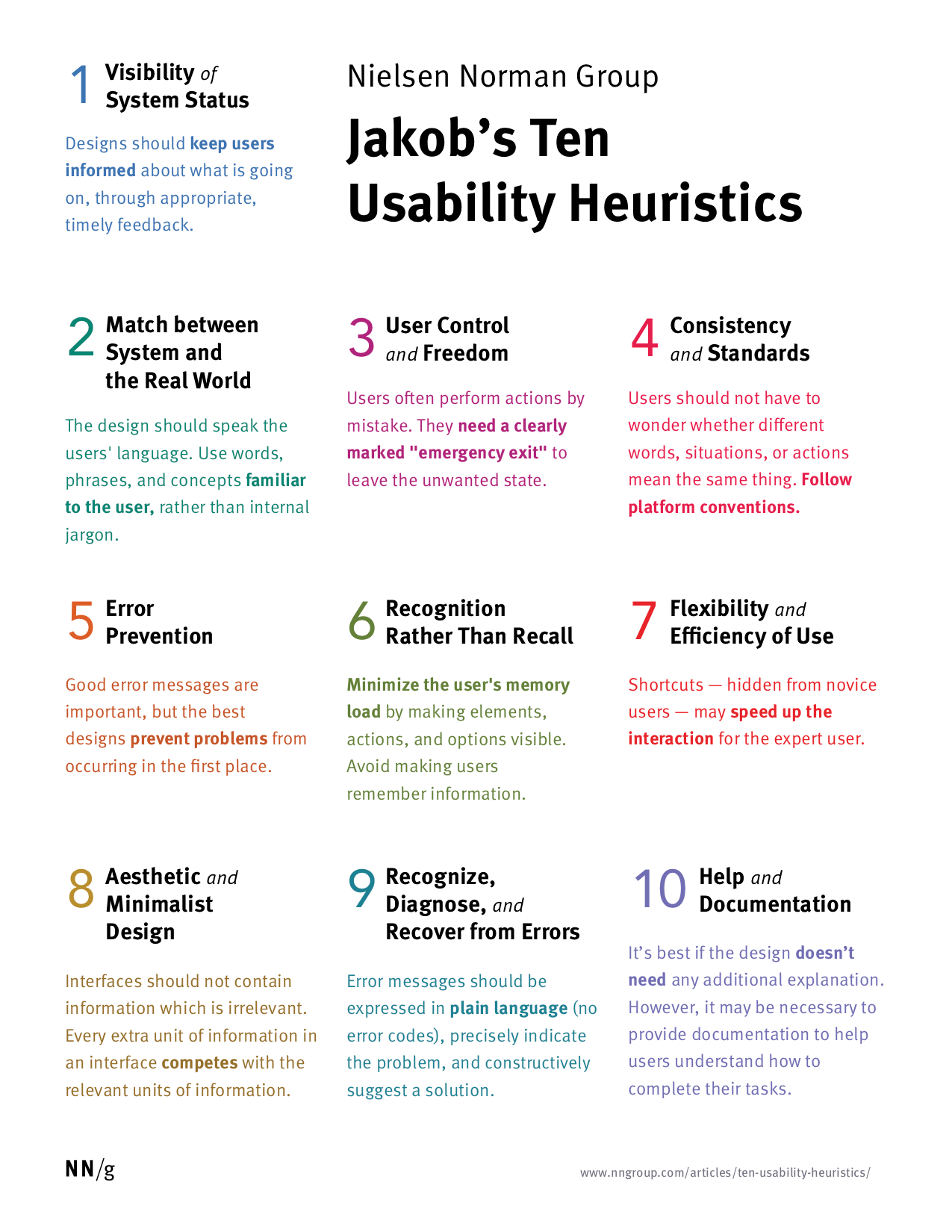
The issues were ranked from most severe to least severe, according to the following scale:
- cosmetic problem
- minor usability problem
- major usability problem; important to fix
- usability catastrophe; imperative to fix
Results
- I found seven usability issues, most of them of lower severity. The detailed results are found below.
Outline of the reference material
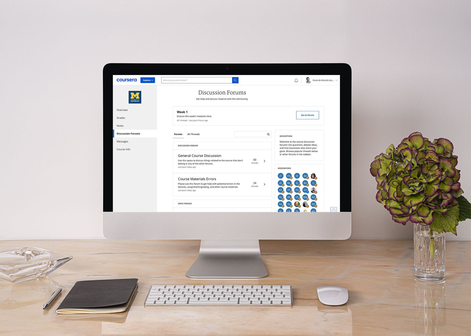
Overview of the discussion board evaluated
Finding 1

Description
- The user must click two consecutive times on the field in order to be able to start entering text. Usually people are required to click a single time, and then they are already able to start typing.
Heuristic Violated
- #4: Consistency and standards
- #7: Flexibility and efficiency of use
Severity
- 3
Suggestions for improvement
- Make it possible to start entering the text after clicking the field a single click.
Finding 2
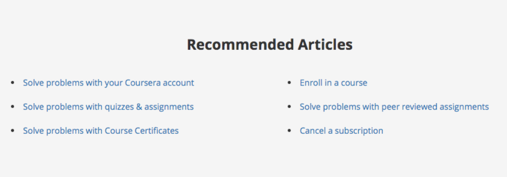
Description
- There are just 'Recommended Articles' in the Help page.
Heuristic Violated
- #10: Help and documentation
Severity
- 2
Suggestions for improvement
- Articles answering the 'Most Common Questions' should be displayed, with its titles formulated as questions.
Finding 3
Description
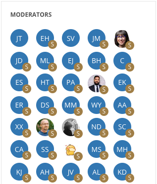
- The fact that some moderators have photos and other don't can make the user wonder if they are somehow different in terms of level of activity in the forum.
Heuristic Violated
- #8: Aesthetic and minimalist design
- #4: Consistency and standards
Severity
- 2
Suggestions for improvement
- Make it a mandatory for all moderators to upload a photo of themselves (or basically any image), so that the initials are not displayed.
- Another alternative is to offer the option of choosing avatars from a pre-populated library of avatars.
- Lastly, automatic randomly generated avatars could also be discussed as an alternative.
Finding 4
Description
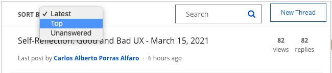
- This sorting by 'Top' posts is confusing... What criteria are being used to determine the top posts? This is not clear enough.
Heuristic Violated
- #4: Consistency and standards
Severity
- 2
Suggestions for improvement
- Replacing the single 'Top' sorting for two different criteria: 'Top Viewed' and 'Top Replied'. Or maybe using just 'Top Replied', as this shows the threads with more user engagement.
Finding 5
Description
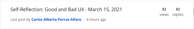
- The number of views and replies for each post are next to each other, as if they were equally important. Actually the number of replies is way more important than the number of views, because it informs the real level of engagement that the users have with a certain post.
Heuristic Violated
- #8: Aesthetic and minimalist design
Severity
- 2
Suggestions for improvement
- The number of views should be moved somewhere else, and be shown in smaller text. Probably next to the timestamp of the thread ('6 hours ago', in this example).
Finding 6

Description
- There are no autocomplete suggestions for the search field.
Heuristic Violated
- #7: Flexibility and efficiency of use
Severity
- 2
Suggestions for improvement
- Enabling autocomplete suggestions, which will help users find what they want with less effort.
Finding 7
Description
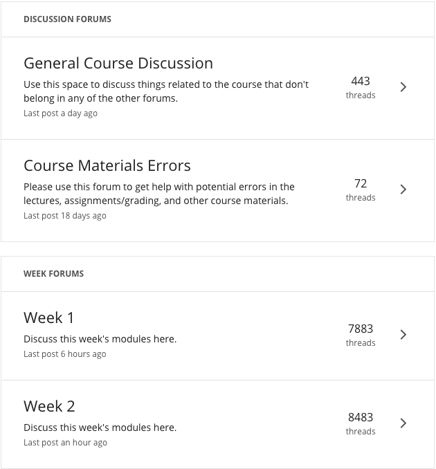
- There are no icons representing the different types of forum.
Heuristic Violated
- #6: Recognition rather than recall
Severity
- 1
Suggestions for improvement
- The usage of icons could make it easier for the user to distinguish the different kinds of forums (weekly forums, general forums, etc.). They could help make the user to visually anchor how the forums are different without having to read the text descriptions.